
It is not every time I go home from a hike knowing I have caught a treasure on my SD card. This past Saturday was that day. I knew this was it the moment I found the lake and the moment I framed this shot after dozens of various perspectives and takes. It was early in the morning with sun quite low, so no heat convection yet, no breeze, no waves, perfectly glassy water. The entire scenery exuded peace and serenity and I think it shows aplenty in the photo. My goal was to get at least one shot worthy of a 13×19 monochrome print, which could be matted and framed, and since I was shooting infrared on a sunny day, monochrome was a no brainer. I was ready to put my Canon PRO-100 large format printer through its paces. It produces such lovely monochrome prints with tonality and gradation not far from a Prograf, which is out of my price range.
As an aside, I just made a mental note to write up something about my PRO-100, perhaps take a few shots of my prints and talk about the setup and calibration. It’s been quite a journey. A rewarding one.
That morning, the photographing part was a breeze, I don’t remember most of it, walking around on autopilot, setting up the tripod, shooting, trying different spots, moving over a few feet, shooting some more and just working the scene without much thinking. I was in the zone. Experience has taught me that when I think I have found “the shot”, I go and do myself and favor and shoot more. So many times did I walk away from a place thinking I found a real keeper, only to come home and in dismay see the picture misfocused or the composition not being as incredible on a big screen as it were on that tiny camera display.
But on that day, not only did the picture look like what I saw on the camera, it surpassed all my expectations. It really captured what I felt while standing behind the tripod.
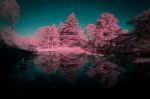
Then the post processing agony started. What to do with it? I originally wanted a monochrome, which is what is shown at the top. That took me couple hours of tinkering and trying different looks in Silver Efex. Be it high contrast, or mellow sepia, I also considered an HDR look (water reflections work very well with HDR). In the end it was just a plain standard monochrome with lots of manual tweaks. I had so many Control Points in this picture I could barely keep track of them and what each of them was doing. I was very pleased with the result and will surely print it. But then, I started thinking about other options. This was an infrared after all, so channel swapping was a logical next step and this is where the problems started. None of the trees had any leaves, so the cyan color was very muted and the tobacco sky too was not very vibrant. Additional two hours later, after numerous adjustments to the white balance and repeated swaps of blue and red channels in PhotoLab, I threw in the towel and gave up. It simply would not work. 4 hours staring at the screen.

Disappointed, hit the reset button in PhotoLab and removed all adjustments and went to do some 4×6 test prints of the monochrome version, to prep it for large format and try different contrast options. Just for kicks and giggles I also printed the untouched, straight out of camera DNG color IR file, so I could compare the tonality with the monochrome print side by side. And that’s when the holy #$%@ moment came. As soon as the color print came off the printer I could not believe my eyes. That one was for the books! I started feverishly changing settings, tweaking contrast, vibrance, adding control points all over the place again and few more hours later I came up with what you see above.
I shoot 590nm infrared, so this wavelength not only has IR, but also part of the yellow and red visible spectrum, so straight out of camera pictures are not very pleasing – when properly white balanced the skies are reddish orange or tobacco, and foliage is a shade of cyan. It’s the channel swapping where all the magic happens – the famous fake colored purple, yellow, green fields you see on social media. I use this filter over the standard 720nm because of its flexibility while adjusting channels – there is simply more data to work with in the post, and it shoots faster shutter times than a 720, which is a plus in street photography and moving subjects. The struggle is that the yellow band can make things dirty or tinted when you try to imitate a 720nm filter with white foliage and deep blue skies, so I often go straight for monochrome and do not bother with channel swapping and never in my life did I consider to use a raw unprocessed 720nm file for print. Until today. I will do 13×19 on both, but thus far my vote is for the color version to be framed and hung on the wall.
I’ve re-learned a very important lesson:
The art of Photography is a trifecta of shooting, processing and printing. If you are truly serious about photography, or just want to get better at it, print your photos and look at them over and over. They reveal every mistake and also show real beauty when done right. There is something magical about printed paper and it puts my dual 5k fully calibrated monitors to shame every single time. I’ve heard numerous times from different pros how important print is in becoming a better photographer. They are right.
They also don’t spend 7 hours on a Saturday processing and printing a single photo. I have yet much to learn…


Leave a comment