Introduction
I’ve said it before and will say it again. IR is a picture of light we can’t see. By default, IR shots will always have fake color, if any. Always. The color will heavily depend on the type of filter you are using. Simply put, if you include more of the visible spectrum in the picture, you will have more colors. These colors will be more diverse at the end. That may be a blessing, or a curse. We’ll touch on both.
I only own a converted camera with a 590nm filter. I can’t do direct comparisons between various filters. However, if you head over to LifePixel, they have a really good gallery showing off the differences between the wavelengths.

Whether you can process color in IR, and what color, depends on your filter. By looking at the above graphic you can see, that using a 830 nm filter won’t give you any usable color, because that is out of visible range, so these filters will yield pictures with slight red or rust color, but all you can do is to convert them to B&W – there is only one color to work with, so B&W ends up being your only option.
720 nm filter will have much more of the tobacco/rust color and foliage will be mostly monochrome, so those are perfect for channel swapping to make blue skies and white trees, or other creative color renditions.
665 and 590 nm filters will introduce orange and yellow into the mix (they show as teal or azure color on IR) and give you more latitude in color processing.
I own a converted camera with 590 nm filter and my current workflow is as follows:
- Basic enhancements – PhotoLab
- Channel swapping – Affinity Photo (optional)
- Halation re-introduction – Nik Color Efex
- B&W conversion – Nik Silver Efex – writing a separate post
- Final touch – PhotoLab – fix color issues
It is worthy of noting that even though two steps are optional, they have to be done in that particular order for things to work. Basic enhancements will include the usual suspects: tonality, contrast, cropping and geometry, blemish removal and localized adjustments. At this point the photo should be good enough to put into Affinity, if I want to do channel swapping – I do that only seldom. One step I never omit is #3, halation re-introduction in Color Efex. Without this, you may have interesting colors and contrast, but not anything what looks like a true IR image – it needs radiance, it needs to glow and Color Efex is one of many ways to achieve this. If I’m happy with the result, I may or may not take that enhanced photo to Silver Efex to do a B&W conversion. Again, to get the IR look, you need to run the photo through Color Efex first, before converting to monochrome.
Basic Enhancements
I won’t include any elaborate screenshots here, as this is a run of the mill process, but in case you are a PhotoLab user, the following tools are what I normally use:
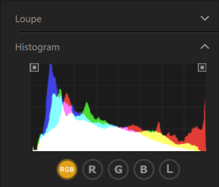
- Histogram – turn on shadow/highlight clipping to spot issues!
- Light – DxO Smart Lighting – set to slight or medium
- Light – Contrast
- Color – RGB White Balance, in case I missed the WB in camera
- Color – HSL – at the end, if the channel swap colors look off
- Geometry – to fix perspective
- Local Adjustments – using the control points to fix exposure, contrast or color issues, create gradients or vignetting
Channel Swap in Affinity
I use Affinity Photo for this and even though it is not a Photoshop, it is very close for a mere fraction of the price and the app is easy to use and fast. It can do focus stacking and stitch panoramas too!
Here is my flow:
- Open the photo in Affinity
- Develop the DNG – I usually already fix the exposure in PhotoLab, so hardly ever make adjustments in Affinity while developing the RAW image
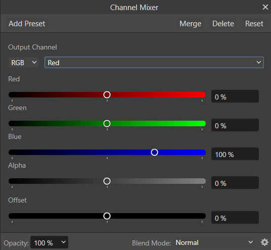
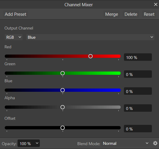
- Go to menu >> Layer >> New Adjustment Layer >> Channel Mixer…
- You will see a pop up like the one below
- Here is what you need to do:
- In Red Output Channel, set Red to 0% and Blue to 100%
- In Blue Output Channel, set Red to 100% and Blue to 0%
- What you effectively did is to swap these two channels
- Now your skies should be blue and foliage grey or yellow
- Export the image as TIFF back into its location
- PhotoLab will immediately pick it up
- You can continue processing further from PhotoLab
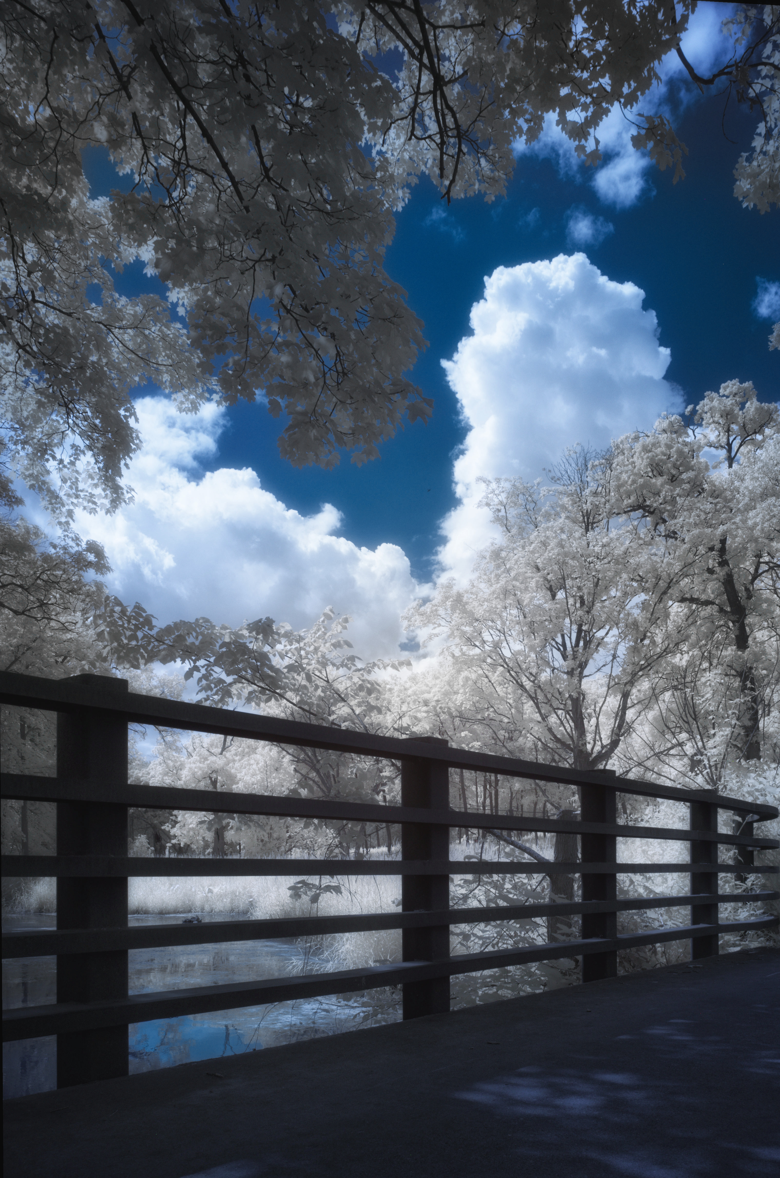
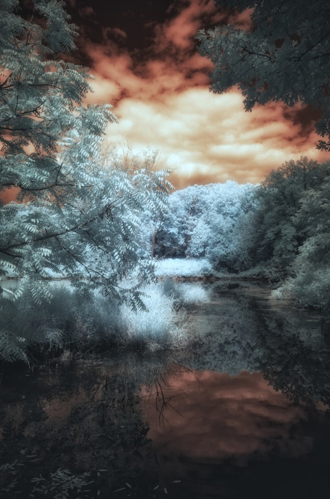
Here is how the original photo looked when it was processed in PhotoLab with some basic adjustments to fix exposure and contrast. Notice the teal colored foliage and tobacco/orange sky.
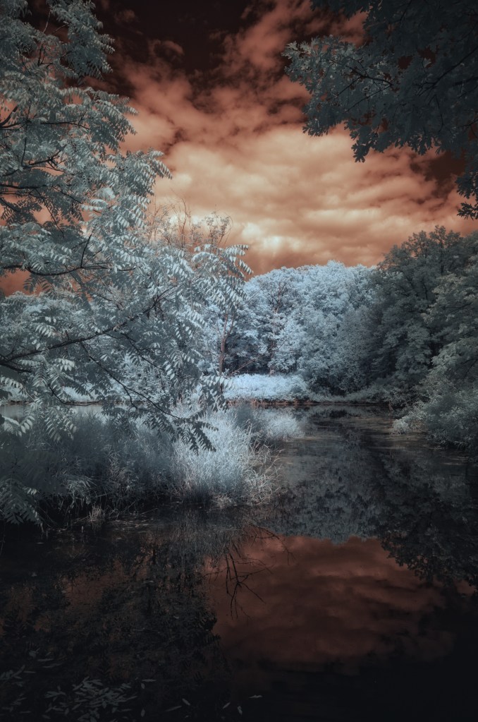
And here is how it came out of Affinity once I exported it as a TIFF and swapped the red and blue channels. Notice how the teal foliage became faint yellow and the sky obviously turned back to blue.
If this were an IR shot from a 720 nm filter, the foliage would have been white, but because my 590 nm filter also passes yellow spectrum, my foliage is on the yellow side.
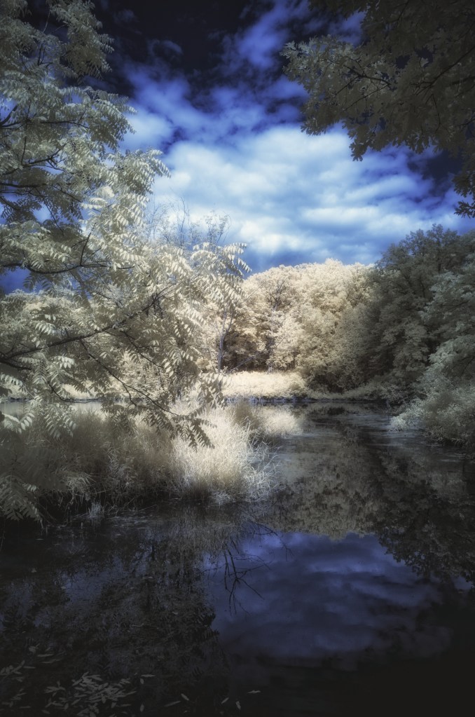
If I wanted to have white foliage and not yellow, to mimic R72 filter look, I’d take this back into PhotoLab and do local adjustments to selectively desaturate the trees, get rid of the yellow, and re-export.
Processing in Color Efex
As I’ve said at the beginning, this is an absolute must, because this is where we create our blooming halo effect and give the photo an ethereal IR “look”. Here is one really cool thing about PhotoLab and Nik – they are both owned by DxO, so they actually have a level of integration. You can export a photo from PhotoLab (generates a TIFF), process in Nik, Save and it takes it back into PhotoLab!
My flow is as follows:
- Do basic enhancements in PhotoLab
- From PhotoLab click the Nik Collection button
- Open it with Color Efex – Nik collection has tons of other apps in it and they are all very powerful and unique
- Once the photo is loaded in Color Efex I add these:
- Look at my screenshots to see precise settings
- Turn on Histogram and turn on clipping alerts, so you can see on the image when you start clipping the whites or blacks!
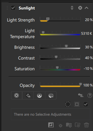
- Sunlight filter – dynamic contrast about 50-60%
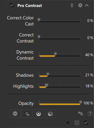
- Pro Contrast – dynamic contrast about 40% and use Shadows and Highlights sliders to protect them from clipping, so watch your histogram as you adjust these
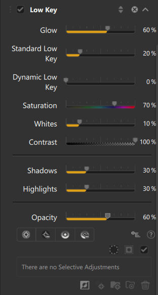
- Low Key – glow about 60%, again protect highlights and shadows by watching the histogram, this really darkens the image, so I do opacity no more than 60%, or way less
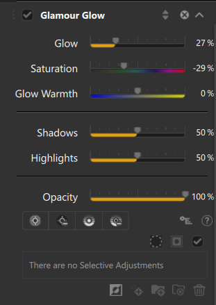
- Glamour Glow – Glow 30% and again protect highlights and shadows, so you don’t start clipping. Histogram is your best friend
- Click Save to send the image back to PhotoLab
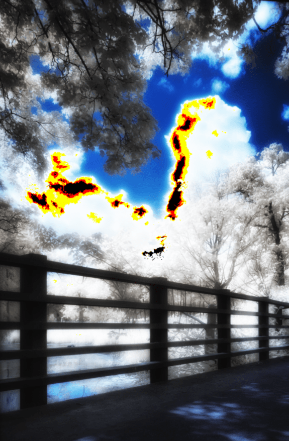
This is one of the most important tools in post processing. Without a histogram you will get lost very quickly. And checking the boxes in the two squares in top corners of the histogram will literally start highlighting parts of your photo when you start clipping the whites or blacks, at which point you are losing information from your photo and are painting either black or white. You want to avoid this! So watch the histo and play with the Highlights and Shadows sliders on each of the filters to remove the clipping and not ruining your work.
A frightening example where I’ve deliberately ruined the photo by maxing out the dynamic contrast slider and the histogram started showing me where my clouds were clipping (losing information to pure white). See the black, orange, yellow patches in the cloud? Backing off the slider to make these disappear will help you keep proper tonality and contrast.
I usually keep the Sunlight filter at full opacity. This is what actually creates the basis of the halation and I keep the light strength at about 20-30%
With the Pro Contrast filter, the most important slider is Dynamic Contrast – this is what takes that Sunlight halation and softens it by dynamically adding contrast to areas with low contrast. It creates a very ethereal look by itself! Watch your histogram for clipping!
Low key will more or less add a very strong contrast and also really heavily darken your photo, so use it sparingly and with judgment, because not only does it add contrast it also boosts color contrast as well, your colors will really pop with this and it may look too jarring. Be careful with this filter, if this is your final image and you won’t be turning it to B&W.
Final icing on the cake using the Glow slider of the Glamour Glow filter. This one is not necessary, but I find it useful in winter IR photography when there are no leaves on trees. In summer shots with tons who glowing white hot leaves I back this filter off to opacity below 50% to avoid weird artifacts in the sky.
Before Color Efex – it’s OK, but too dry and has no breath to it
After Color Efex – more whimsical and dreamy look than before
So, there you have it. This is my workflow for processing color IR images and re-creating the look of traditional IR film. I’ve created some presets for myself to speed things up, but I tend to do a lot of extra tweaks and local adjustments, because each photo is unique, so my presets are more of a starting point than anything.
Happy days!


Leave a comment